


















Learning about dark and light by 3dcheapskate
Close
Hover over top left image to zoom.
Click anywhere to exit.
Members remain the original copyright holder in all their materials here at Renderosity. Use of any of their material inconsistent with the terms and conditions set forth is prohibited and is considered an infringement of the copyrights of the respective holders unless specially stated otherwise.
No AI - This artwork was created entirely by hand or with traditional digital tools.
Description
(Constructive criticism greatly appreciated.)
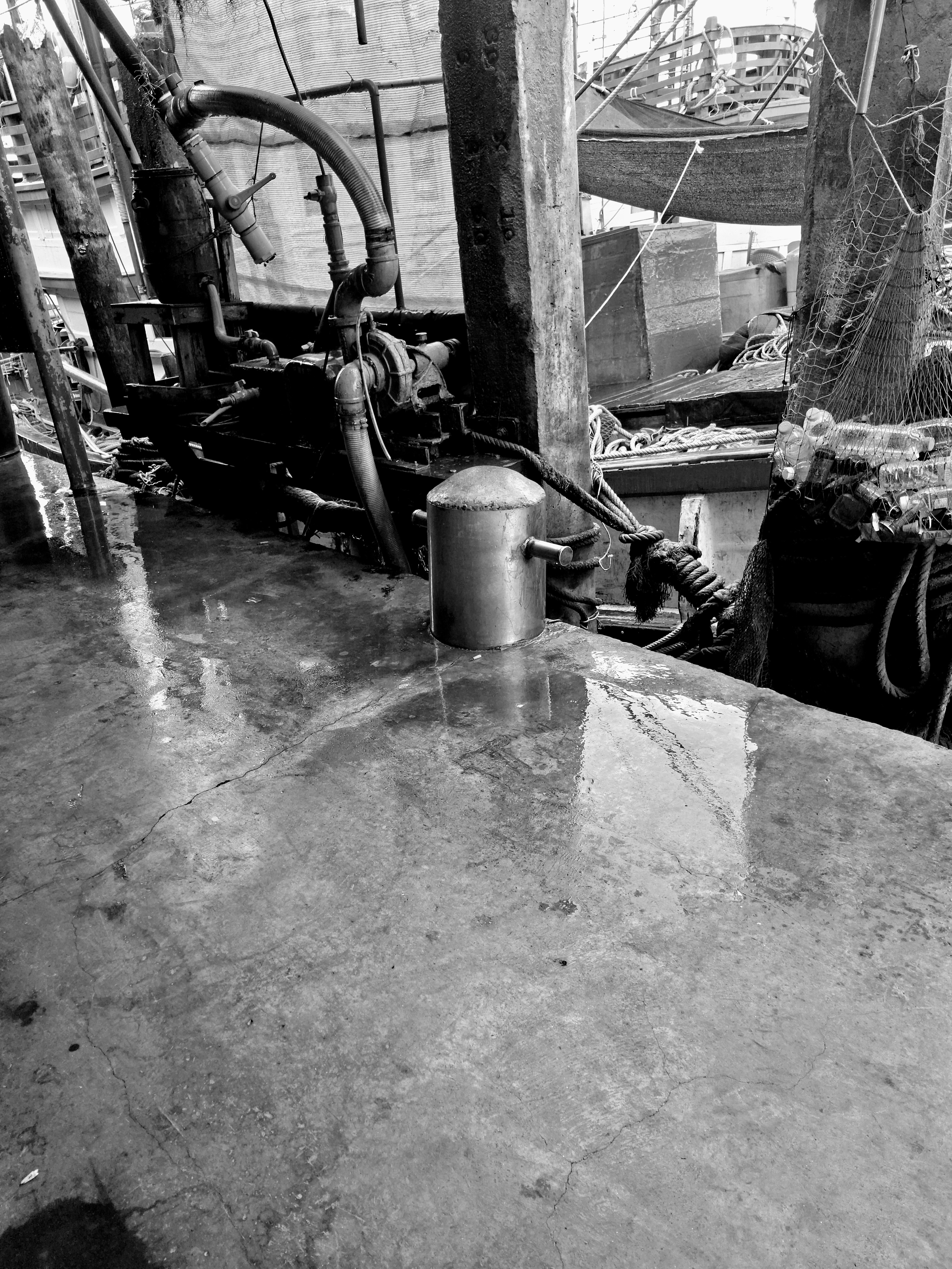
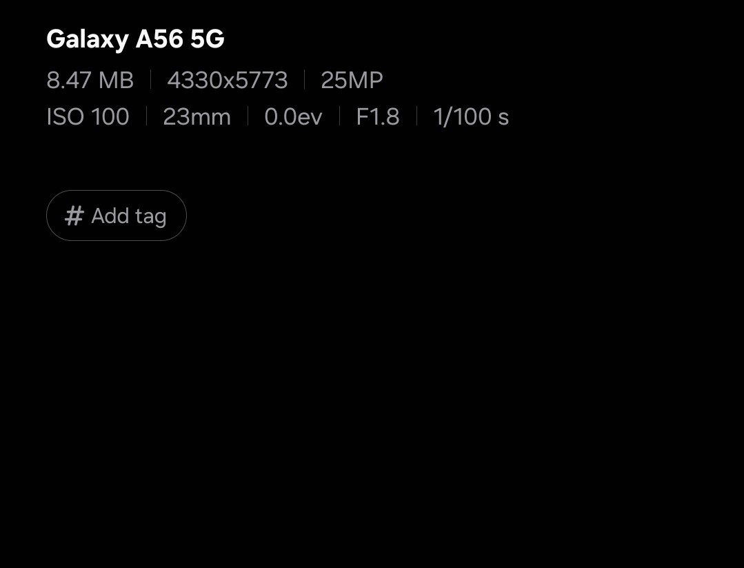
A desaturated crop from a photo taken with a Samsung A56 idiotphone camera trying to get a good tonal balance by eye. I've included a screenshot of the camera settings as the Renderosity gallery shows incorrect information
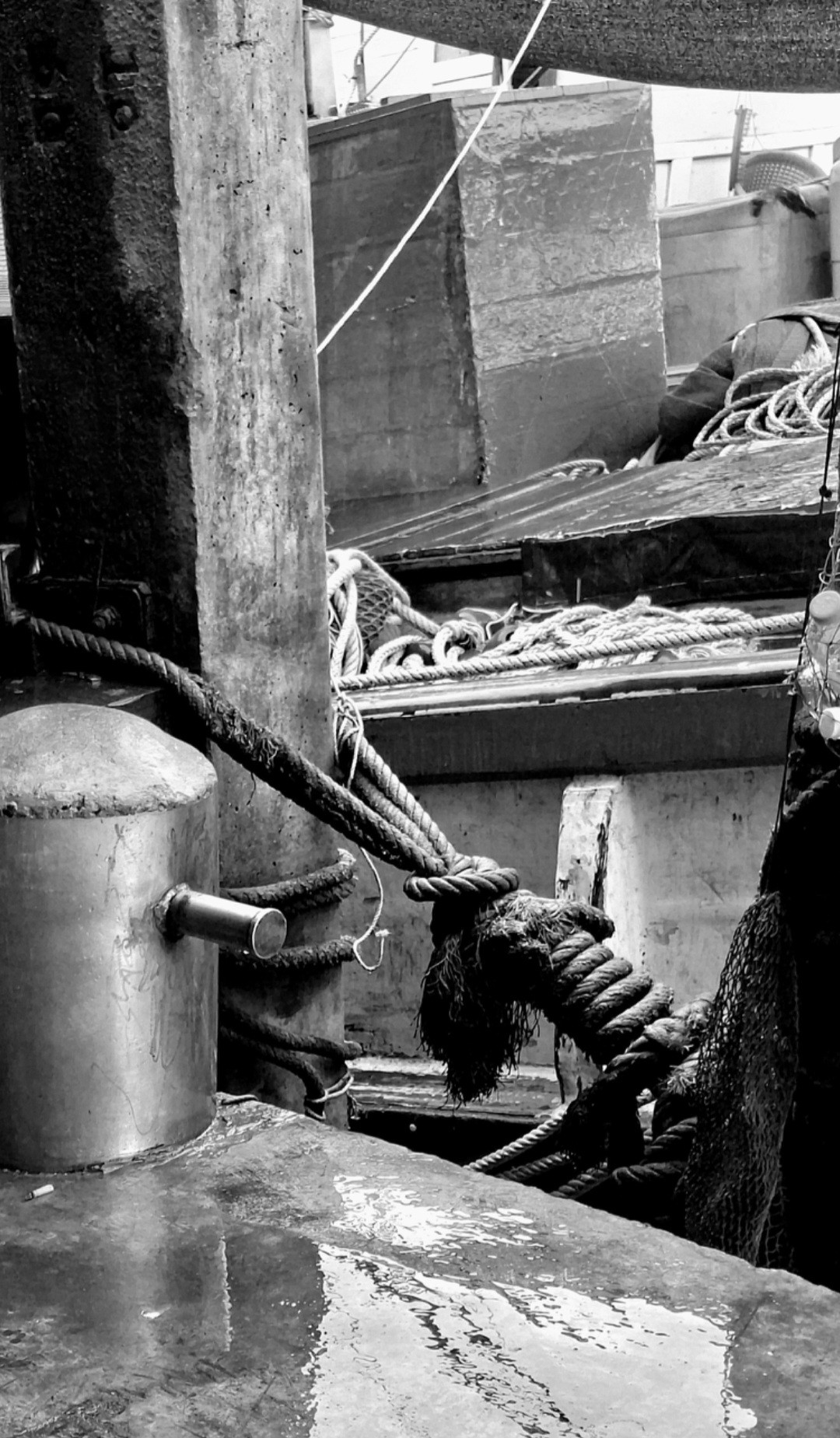
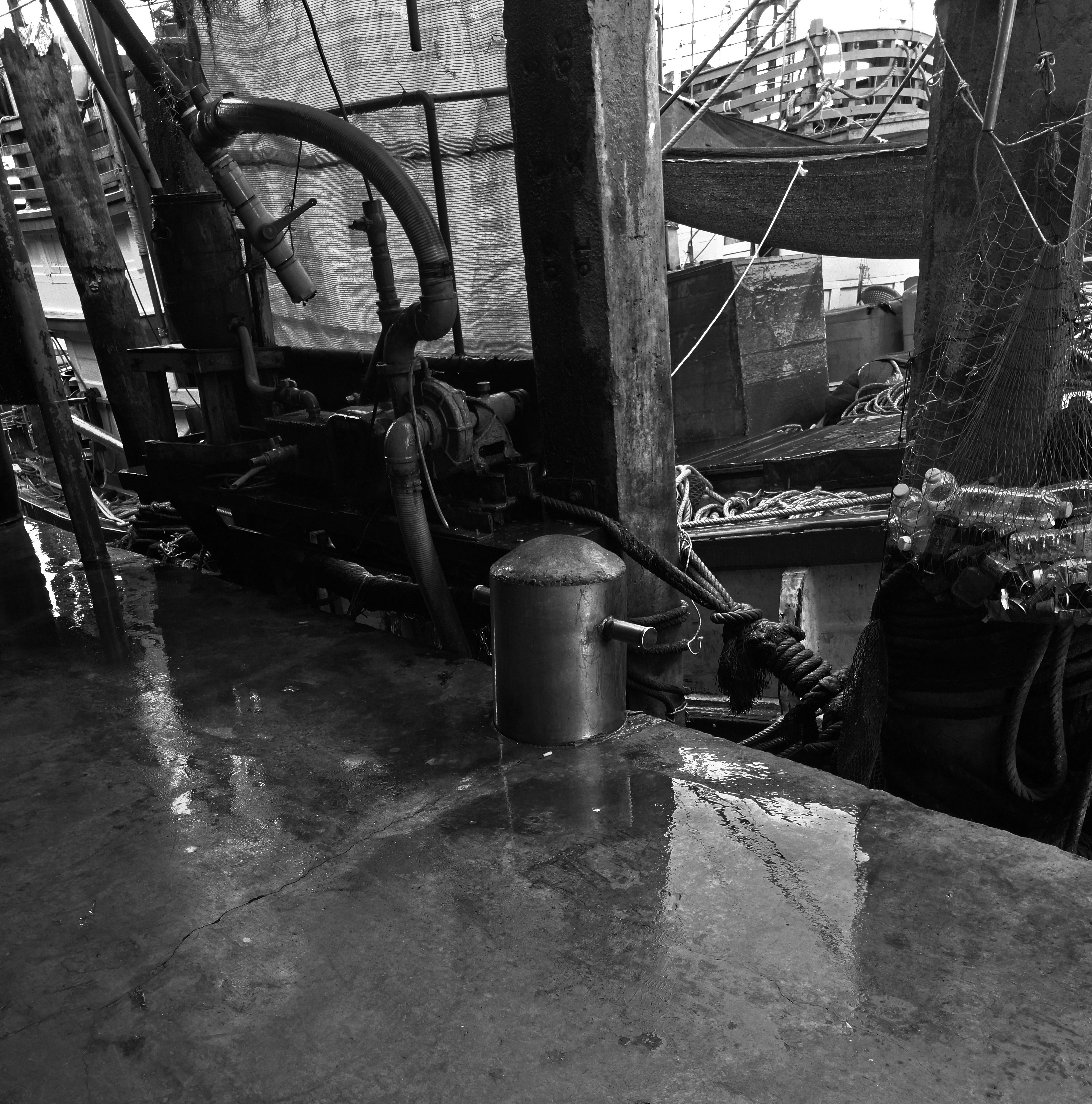
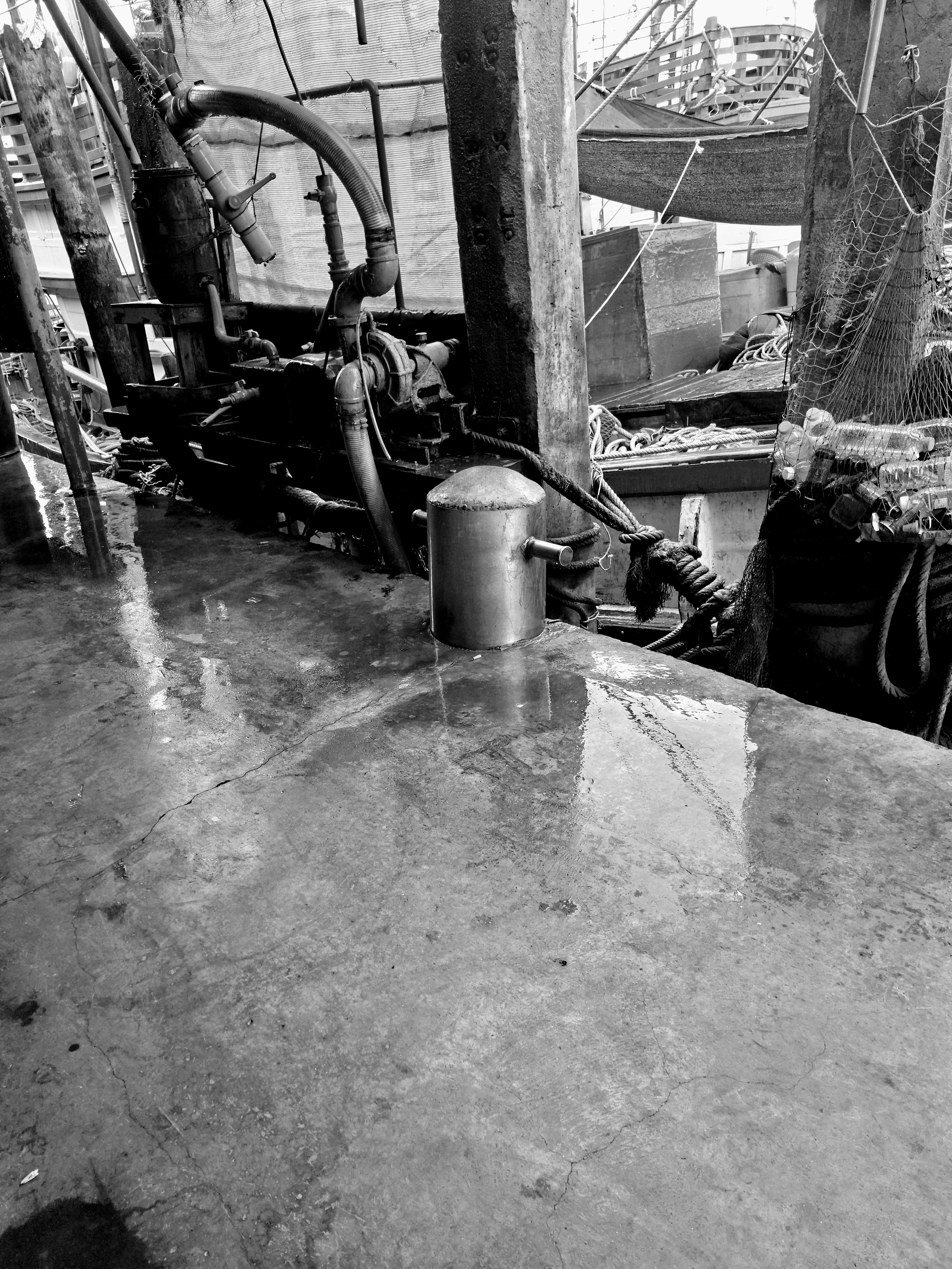
The main image is a crop from a level adjusted and desaturated (using using the default phone gallery app) version of my original Samsung A56 photo (image 10). There are two fishing boats side by side at the quay, but the stuff in the foreground makes them difficult to distinguish, giving parts of the original photo a pleasantly abstract look to me.
The current shadow and light mini challenges plus a short YouTube video about John Sargent and Ansell Adams were the inspiration for this.
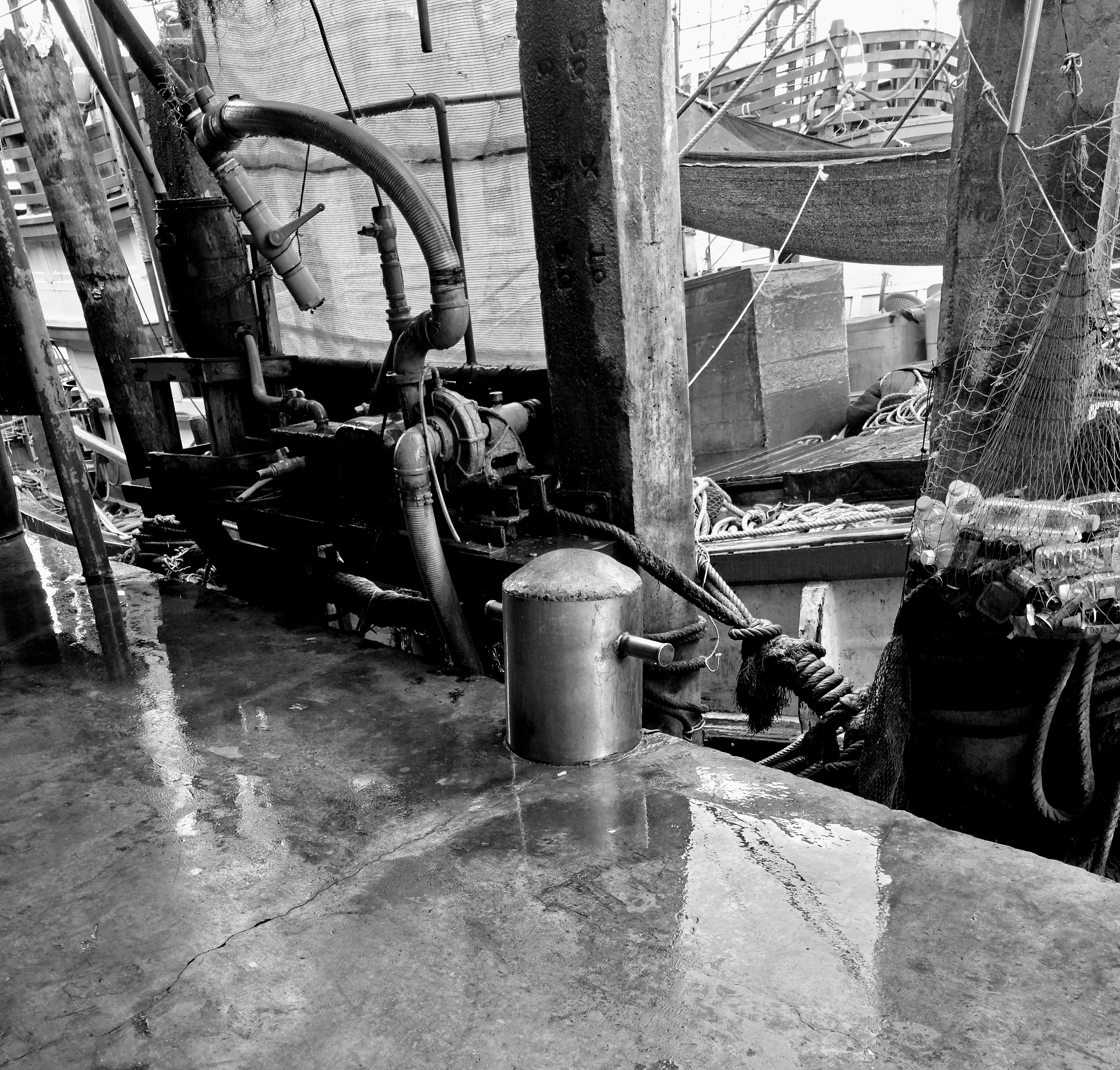
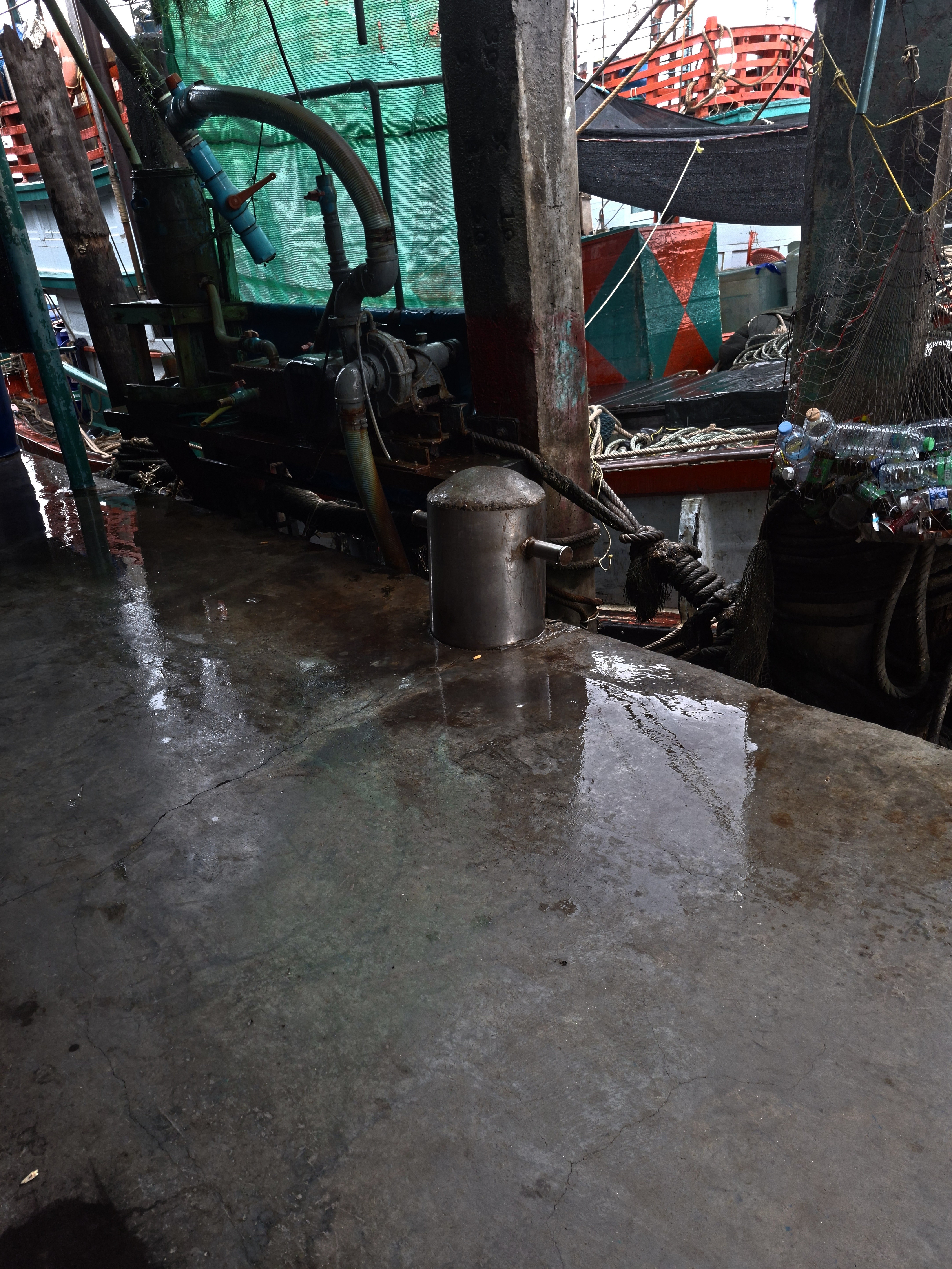
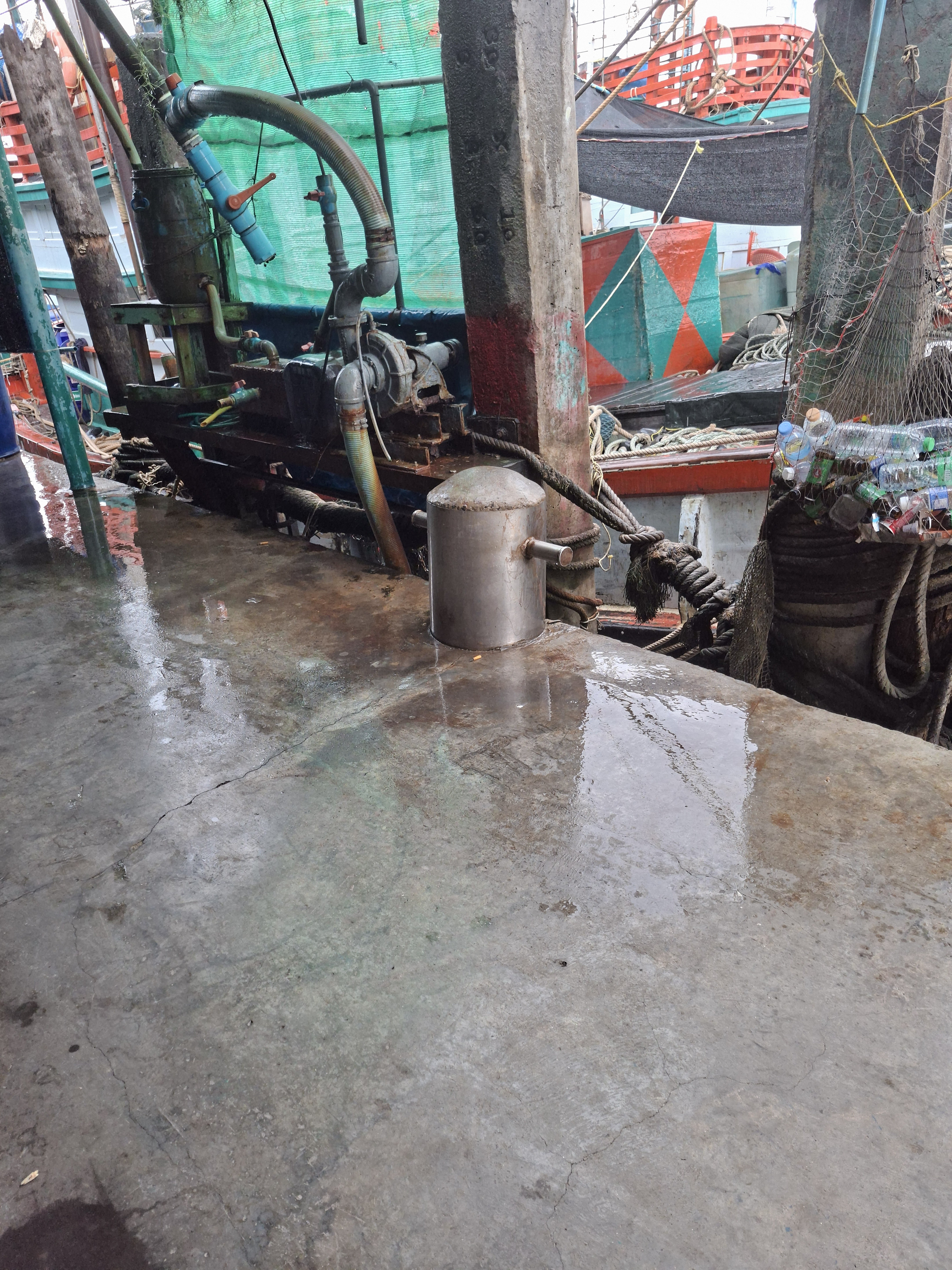
My original photo was the last (10th) image, taken on a Samsung A56 idiotphone. I liked the darks and lights along the slightly sloped line across the pump, bollard and rope.
The next (9th) image is simply my original photo desaturated using the Gallery app that came with the phone (Edit > Saturation, set to -100) - none of your multiple methods of desaturation here.
The 10th image is my original photo and the 11th is the canera settings - the ones the Renderosity gallery shows are wrong.
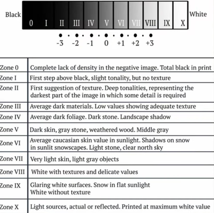
Checking the desaturated version against the zone chart (image 8, a crop of a screenshot from the video) I was quite pleased to see that I'd got a reasonable across the board spread of tones, rather than the usual all bunched up in one place. Except for the bottom half of the photo, the mid-grey wet concrete floor.
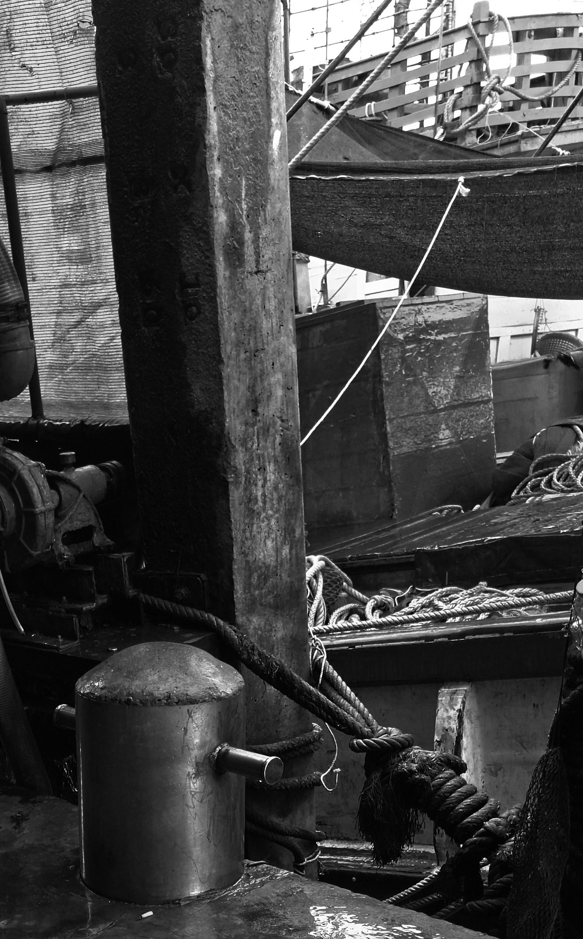
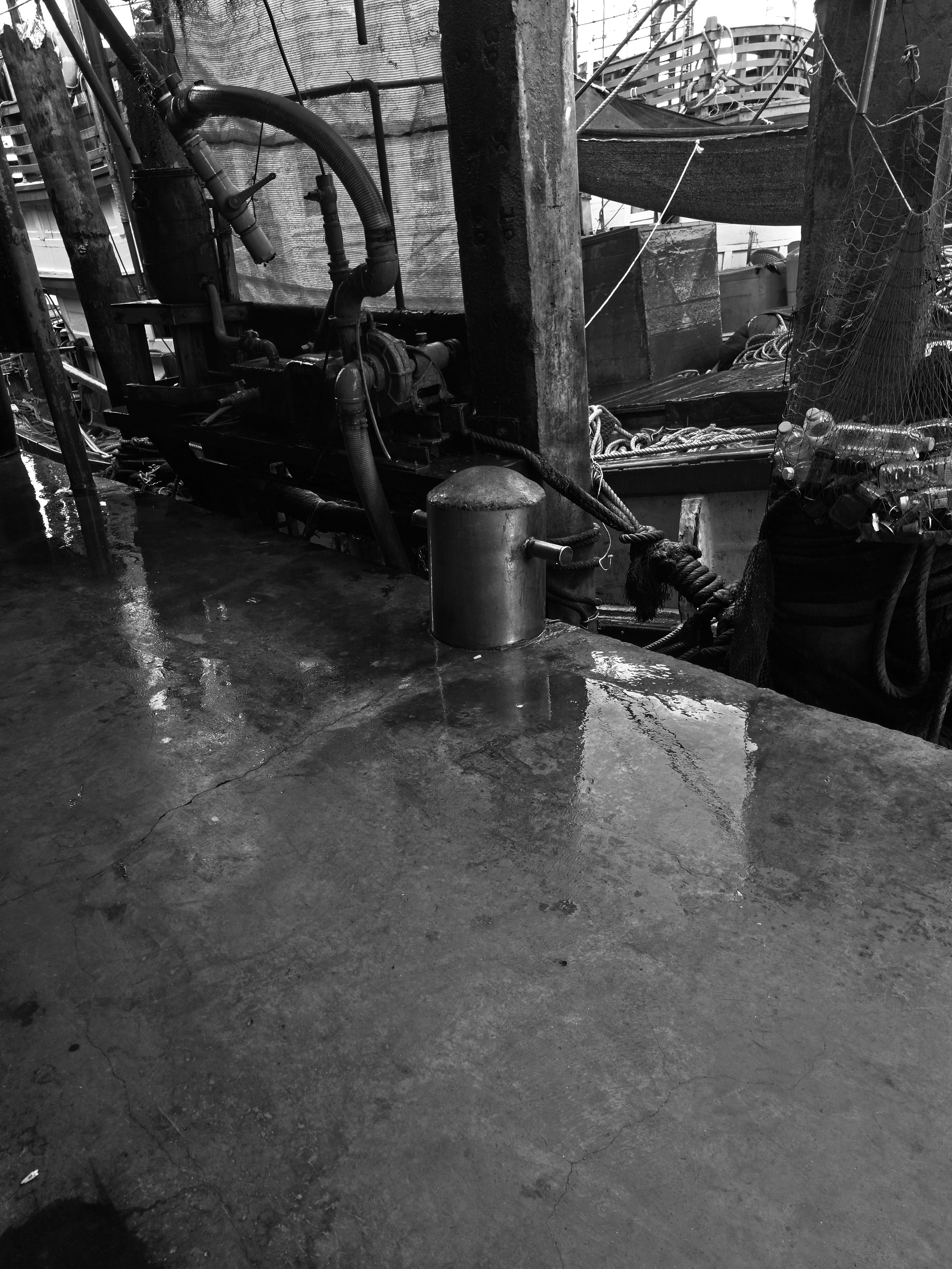
But before I'd thought to simply desaturate my original image, I'd already done some fiddling with levels (can't recall exactly what) on a copy of the original followed by a desaturation (image 5) and crop to remove a lot of the mid-grey floor(image 3), from which the main image is a further crop.
My eye was them caught by the parts of the two boats visible in the top right quadrant of desaturated images 5 and 8 - it's almost all mid-grey or lighter and the red/green triangles on the box fade into one. So I took another copy of my original and had a play to try and improve the zonal coverage in this area. A combination of simply Light Balance* to -100 (image 7) followed by Saturation -100 (image 6), a crop (image 4) and another crop (image 2) seemed to do the job, although a bit too dark now I think?
Constructive criticism greatly appreciated. You're welcome to edit any of these images yourself and upload your result, plus notes/screenshots of whar you did, to show how I could improve on this.
*Apparently, according to the AI result of a Google search, Samsung's Gallery app Light Balance uses 'AI-enhanced editing'.
#photo #photograph #photography #samsungA56
#monochrome #blackandwhite
#NO_AI #noAi
#process


Comments (1)
There are so many small details in the photo that is draws in the attention, to figure out the dock side layout. Very cool.
Thanks. When I first looked at the b+w version of the full image I was really confused by what I saw in that upper right quarter, even though I knew exactly what it was.